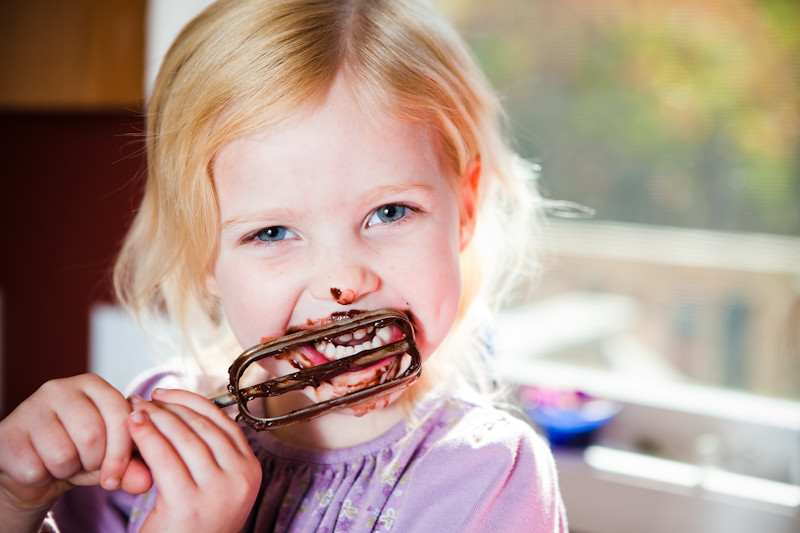
10.21.10 – kitchen utensil

A

B

C

Only 3 submissions this week.

Vote by telling us which pic you like the best by LETTER and tell us WHY in the comment section.

Only votes on the blog comment section are official and you can only vote for 1 pic. Voting will end at 10am on Saturday Oct 23rd.

All of the votes for the winning picture will be automatically entered in a random drawing and the winner picked will get an 8×12″ print of the winning picture!

The winning pic and print give away winner will be announced Saturday the 23rd on the blog.


Click on the word “comments” on the bottom of this post, and then click on name/url if you don’t have a google account, and type in your FIRST and LAST name for us so we know who you are.

ANONYMOUS POSTS WILL NOT BE ACCEPTED and only comments on the blog count!

go vote and tell your friends to vote too!!!
JIM baker

Timothy S. MilliganOctober 21, 2010 - 4:17 am

C

I expected a knife, and instead was surprised to discover this is a family portrait, a short essay on procreation. The other two struck me as a little cliche? Not much, but this seemed a little more original.

My name is Tim Milligan

colleenOctober 21, 2010 - 5:43 am

Outstanding week. Incredibly hard choice, but I melted with A. Love (LOVE) them all! B is very cool and C was very funny!

Jeremy WOctober 21, 2010 - 10:57 am

A is ridiculously cute. B has some great lines and sweet colour choice. C is just plain funny. I vote for C. Great photos all around.

Claire FrameOctober 21, 2010 - 12:00 pm

A!

I love the lighting. I also love B and thought it was super creative.I think C was pretty funny, as well.

Ashley AdelgrenOctober 21, 2010 - 2:34 pm

My vote is for B. Photo A is SUPER cute, but I love the color and the modern-art look that B has to it. I would totally hang it on the wall in my kitchen. πŸ˜‰

KatyOctober 21, 2010 - 5:52 pm

C for sure. i love the spork and the conposition of it. I agree with the guy who said it looked like a family portrait…that’s exactly what came to my mind

The Moldy CannoliOctober 22, 2010 - 3:08 am

I like C. It is cute how instead of a fork, their is a spork. Sporks remind me of Taco Bell and I sure did a lot of Taco Bell eating as a child. yum, yum!

AaronOctober 22, 2010 - 11:05 am

C

It took me a second. At first I was like….wait that’s not right….then I realized how right it really was! it’s funny but it’s also shot really well.

10.16.10 – lit pic winner…

This week’s winner for the literature critique pic is JIM!


This print give away winner is BROOKE!

The winner has 48 hours to contact us at jim@carpediemphotovideo.com to claim their prize! Please send us your address in the e-mail.

Next weeks topic is Kitchen Utensil.

Got some ideas for themes you’d like to see us shooting? Let us know in the comment section. and SOON we’re going to get you guys in on the action doing the photography so start dusting off your cameras and start practicing.

JIM baker

brookeOctober 17, 2010 - 3:58 pm

I have an idea for a photo critique. I did a photo once in photography class of an old wagon on our front porch. I titled it “Childhood Memory”.

colleenOctober 18, 2010 - 9:05 am

how about these ideas:

music
air
shout
sleep
feast/famine
dance
waste

10.14.10 – lit pic critique


Is thursday becoming your favorite day of the week? This week’s theme was LITERATURE.

Vote telling us which pic you like the best by LETTER and tell us WHY!

Only votes on the blog comment section are official and you can only vote for 1 pic. Voting will end at 10am on Saturday Oct 16th.

All of the votes for the winning picture will be automatically entered in a random drawing and the winner picked will get an 8×12″ print of the winning picture!

The winning pic and print give away winner will be announced Saturday the 16th on the blog.


Click on the word “comments” on the bottom of this post, and then click on name/url if you don’t have a google account, and type in your FIRST and LAST name for us so we know who you are.

ANONYMOUS POSTS WILL NOT BE ACCEPTED and only comments on the blog count!

go vote and tell your friends to vote too!!!
JIM baker

and while you’re at it… LIKE our new facebook page!

joanOctober 14, 2010 - 5:12 am

Definitely D

KatyOctober 14, 2010 - 6:02 am

tough choice between A and C. But I think I’m gonna have to go with C. I love the nature and the camp fire in the background.

Gary HuettOctober 14, 2010 - 6:14 am

D – like the grainy old look. Words are great, too. Question: Is the Word of God “literature”? Don’t know. I guess it could be, but we are cheated if we leave it at that level and not take it as the pouring out of God’s heart to us.

brookeOctober 14, 2010 - 6:45 am

My vote was D. Sorry for the confusion!

Sam WhittakerOctober 14, 2010 - 7:10 am

D. it has a rustic feel to it. draws you in and almost forces you to read the words. Question: is that barn thing in the back of B really a library?!?

Christina HusemanOctober 14, 2010 - 3:03 pm

I choose C. It makes me think about snuggling up with a good book next to a warm fire in the winter.

colleenOctober 14, 2010 - 6:50 pm

B- it’s hard for me to see the Bible as “literature”… I guess it is technically, but not what came to mind. So that knocks off C & D. A is nice, but I felt like I was more drawn to the TV screen and trying to make out the person and the book was an afterthought. B, however, moved me – a reminder to how forgotten the library is.

Jeremiah and AmyOctober 15, 2010 - 1:01 pm

I love all the pics, but I am going to vote for photo D. I love the antique feel. It is a neat portrayal of the scriptures.

hannahelaineOctober 15, 2010 - 6:59 pm

that’s tough. d would look best in print but i think c looks the coolest……

d, final answer.

10.09.10 – and the winner is…


This weeks winner for the agricultural equipment/tools is JESS! D got 10 out of 20 votes.


This print give away winner is Russ Baker! (sorry no video this morning I’m on the road)

The winner has 48 hours to contact us at carpediemvideos@yahoo.com to claim their prize! Please send us your address in the e-mail.

Thanks to everyone that participated. Tell your friends, lets try and get 40 people to vote next week.

Next weeks topic is Literature.

JIM baker

joanOctober 9, 2010 - 4:39 am

Congratulations, Jess. I knew those hands. Your getting to be a great photographer. Keep it up.

Love, Grandma N

Kathy AnstromOctober 12, 2010 - 7:34 am

Ok…I made it here ALL BY MYSELF….YES!!!!!!!!!!!!!!!!!

10.07.10 – agricultural equipment/tools critique

A

B

C

D
Hello! Time again for another critique competition between the CARPE DIEM team! This week’s theme is AGRICULTURAL EQUIPMENT/TOOLS.

Vote telling us which pic you like the best by LETTER and tell us WHY!

Only votes on the blog comment section are official and you can only vote for 1 pic. Voting will end at 9am on Saturday Oct 9th.

All of the votes for the winning picture will be automatically entered in a random drawing and the winner picked will get an 8×12″ print of the winning picture!

The winning pic and print give away winner will be announced Saturday the 11th on the blog.


Click on the word “comments” on the bottom of this post, and then click on name/url if you don’t have a google account, and type in your FIRST and LAST name for us so we know who you are.

ANONYMOUS POSTS WILL NOT BE ACCEPTED and only comments on the blog count! (someone always tells me their vote on facebook, don’t be that person!)

looking forward to your critiques!
JIM baker

Allissa BowersOctober 7, 2010 - 3:30 am

Artistically B is my favorite and is my vote, not crazy about the background of it but the subject and colorization I LOVE! Sentimentally I love A, that is one of my favorite sites in the fall, fields being harvested it’s beautiful! BUT B IS MY VOTE!

Michelle CathcartOctober 7, 2010 - 3:40 am

I vote B!! I love the angle and the colors :)

JStanfordOctober 7, 2010 - 4:08 am

I do like D

joanOctober 7, 2010 - 4:26 am

I pick A because I’d like that hanging on my wall.
Those hands in D look very, very, familiar. πŸ˜‰

KatyOctober 7, 2010 - 4:43 am

I really like B and D…it’s hard to choose…but i’m going to go with B. I love the subject and the coloring :)

colleenOctober 7, 2010 - 5:14 am

D- it’s moving and was what I wouldve done with that challenge.

AaronOctober 7, 2010 - 6:33 am

I’m gonna go A here. They’re all really good! I think A really meets my fall mood right now. The land scape, the sun, the clouds…..all speak to fall. A

brookeOctober 7, 2010 - 7:59 am

I too love the color in B but also am not a huge fan of the background. Alas, I am again going to be the oddball and go with C. … Love it. :)

They all are very good!

AimiOctober 7, 2010 - 9:00 am

I would say I like D because to me it tells a story.The working man, who labors for his food, but when you look closer you can tell those hands have done a tuff day of work!! Those finger nails are impeccable!! I like it from far away, not up close. With that I am going to VOTE for A! To me this also tells a story of america. There is someone working in the field, and another man driving to his destination. I think it’s a beautiful pic. Amazing color.

Sam WhittakerOctober 7, 2010 - 10:38 am

D. it tells a story in a single shot.

MelissaOctober 7, 2010 - 12:18 pm

Most definitely D…because that is where the heart of agriculture lies…

Russ BakerOctober 7, 2010 - 12:45 pm

It was a toss-up between A and D. I decided D because A, although a great shot, didn’t show the threshing machine very well (too far off), so it wasn’t as good for the topic. D was sort of the ultimate in tools– hands. That’s cool. That’s how D gets my vote.

CherylOctober 7, 2010 - 12:50 pm

This one is hard I like A and D.
A for the scenery, color and the thresher in the far background.
But D is my vote. Just the whole picture is a story. The hands, dirt and pole to whatever ground tool makes the picture have it’s own story.

The Moldy CannoliOctober 7, 2010 - 2:16 pm

I like D, by seeing the hands, it’s as though you are getting to know the subject.

Ashley AdelgrenOctober 7, 2010 - 2:34 pm

I almost picked B because I love the colors and the moody-ness of the sky, but I don’t like that there’s so much going on in the background. So my vote is D. It’s so compelling and seems to tell a story.. Also, I like the colors (they definitely scream Fall) and how the picture was edited. The only problem is, I think I know who’s picture that is. πŸ˜‰

Andy-Friend To FriendOctober 7, 2010 - 3:53 pm

I choose D. Not only shows the hard work of the harvester but also shows the hard work going into the Lord’s harvest! And yes that can be messy at times too, but always for the best!

markandjeanetteOctober 7, 2010 - 4:17 pm

B, because I like it.

markandjeanetteOctober 7, 2010 - 4:19 pm

B, because its great and i could see it hanging in my home.

JillOctober 8, 2010 - 10:23 am

I like picture A. I love this time of year and the picture captures the season well

ChristinaOctober 8, 2010 - 2:06 pm

I like D because to me it represent all of us hardworking individuals that are not afraid to get our hands dirty.

10.02.10 – this weeks crayon winners are…

This weeks crayon critique winner is… JESS! B got 9 votes out of 22.

Jim’s pic got 4 votes. Jamie’s got 5, and Seth’s got 4.

Check out the video below to see who the winner of the 8×12″ print is!

The winner has 48 hours to contact us at carpediemvideos@yahoo.com to claim their prize! Please send us your address in the e-mail.

Thanks to EVERYONE that participated, we LOVE reading the critiques.

Next weeks topic is FARM EQUIPMENT.

JIM baker

colleenOctober 3, 2010 - 3:24 pm

golly!!

09.30.10 – CRAYON CRITIQUE

Whats up everyone? Time again for another critique competition between the CARPE DIEM team! This week’s theme is CRAYON.

I know some of you wanted to vote last week and could not because of the required google account, that has CHANGED so now everyone can vote.

Vote telling us which pic you like the best by LETTER and tell us WHY!

Only votes on the blog comment section are official and you can only vote for 1 pic. Voting will end at 11am on Saturday Oct 2nd.

All of the votes for the winning picture will be automatically entered in a random drawing and the winner picked will get an 8×12″ print of the winning picture!

The winning pic and print give away winner will be announced monday Saturday the 2nd on the blog.

– JIM baker

A

B

C

D

ANONYMOUS POSTS WILL NOT BE ACCEPTED and only comments on the blog count!

Click on the word “comments” on the bottom of this post, and then click on name/url if you don’t have a google account, and type in your FIRST and LAST name for us so we know who you are.

Allissa BowersSeptember 30, 2010 - 5:37 am

D

Malachi LofferSeptember 30, 2010 - 5:52 am

B, I choose you!

RyanSeptember 30, 2010 - 5:52 am

“B” by a mile

AaronSeptember 30, 2010 - 5:59 am

A seems like it’s out of a 1950’s ad for cereal or breakfast or something. B is cool I really like it. The caterpillar scares me away a little. Cool pic though. C makes me depressed and I think of brokenness. D is cool. I like the circles of wrapper and blend of colors. It’s definitely between B and D…..I think I’m gonna go with D.

KatySeptember 30, 2010 - 6:00 am

Definitely B. I love the color and the way it blends in

joanSeptember 30, 2010 - 6:22 am

I guess I’m old fashioned as I like A. Can picture it framed and hanging on my kitchen wall.

I think I know who did C from an earlier comment…I can smell ’em…

I like B too because of the crazy idea. They’re all well done. I’ll still stick to A…

brookeSeptember 30, 2010 - 6:29 am

As much as I love the color in B… I’m going with A

because I have a soft spot for black and whites. :) I love the contrast in the pic. It almost appears like a drawing.

colleenSeptember 30, 2010 - 6:42 am

All are great, but B is magnificent!

myklSeptember 30, 2010 - 8:48 am

Sher likes B
I’d love A if it were color. Why crayons in a B&W?

ChrisSeptember 30, 2010 - 8:49 am

D.

GarySeptember 30, 2010 - 9:29 am

B. Great mix of color, crayon and caterpillar.

Melissa S.September 30, 2010 - 10:11 am

I choose a…perfect picture for a elem. school classroom I think :)

LarkinsSeptember 30, 2010 - 10:15 am

B – that is one cool @#$ worm!

Carpe Γ†ternum

DL

Jody FitchSeptember 30, 2010 - 10:52 am

I choose (A)
I just like that you cant really see the colors but you know what they should or could be and I love it anyways.. Kinda as in life.. I’d like to think that I or we view ppl in this way. LOL Hope that makes some sense, (Im drugged)

B. Is awesome but somewhat cartoony, I think my young daughter would love it.

C. As someone else said, looks Broken and Im not a fan of being broken..

D. Would be my second choice, really love the way the pic is focused and the use of light.

Gotta say I really enjoy this Jim as well as the breakfast comments and such- I was excited to see what you had for us! :)

ChristinaSeptember 30, 2010 - 11:35 am

I think they are all great, but D is my choice.

Cheryl BakerSeptember 30, 2010 - 11:53 am

This is a hard decision. I like A for the textures in the apples. Just a neat shot.
But I think B gets my final vote. I love the bright green color. The caterpillar is amazing and a cool shot all by its self. Adding the crayon makes it an ever more creative picture.

RosieSeptember 30, 2010 - 1:28 pm

I liked them all, but B is my favorite…maybe because I like green..

Hannah AndersonSeptember 30, 2010 - 1:37 pm

C is definitely my favorite.
It has a simplicity to it. Yet so much depth.

AmySeptember 30, 2010 - 3:15 pm

I vote C

JeanetteOctober 1, 2010 - 2:41 am

It’s definitely between B and C for me. I love the bright colors and the similar angles with the caterpillar and crayon, in B. In C, I really like how simplistic and artsy it is and it almost has a ‘aged’ feel to it.

I think I’m going with C.

OuREOOctober 1, 2010 - 6:34 am

I choose C

very dramatic picture and the depth of field is awesome.

i may see this challenge a little differently than maybe what was expected but C really puts the primary focus on the crayon as opposed to some of the other shots that (although very creative) have elements within the photos that are a bit too distracting and take away too much focus from the crayon(s) themselves.

B does come in a close second but i just can’t get away from that small leaf thats blocking a little bit of the crayon

Sam WhittakerOctober 1, 2010 - 7:32 am

C. it has a different feel to it than the others and immediately sticks out to me. DOF is nice and has great contrast between the blacks and white.

09.23.10 – the CHICKEN challenge

So the Carpe Diem team has decided to get competitive. A little healthy competition is GOOD for us, it keeps our creative juices flowing.

The subject for our little shoot out was CHICKEN.

But we NEED your help. Vote on which picture you think is BEST and tell us WHY in the comment section of the blog. Only comments on the blog will be accepted as official votes.

Don’t worry right now about who shot what, I’ll let you know that once the votes are in. Lets see if we can get at least twenty votes! Voting ends Saturday the 25th at 10am.

A

B


C

D

Thanks!
JIM baker
kristaSeptember 23, 2010 - 5:20 am

#2
the colors and the gutter.
and the chicken’s facial expression, he just made the picture come alive, with a twinge of sadness..

krista

brookeSeptember 23, 2010 - 6:41 am

lol They are all great. I especially love picture D. :) No one captured the chickens emotions like picture D.

j/k I have to say I probably like picture A personally.

TraciSeptember 23, 2010 - 11:14 am

Great shots, all have merit but I’m a sucker for a close up…C, final answer.

πŸ˜€

colleenSeptember 23, 2010 - 11:14 am

B & C are my favorites!

D is sick, guys. come on. πŸ˜‰

LarkinsSeptember 23, 2010 - 11:41 am

This was a hard one. It was a toss up between B and C……drum roll please……..I’ll go with C in the end. I like how the Chicken is just in your face and so dominant! The color contrast is also very cool. The greens, white and reds….pretty sweet I would say! Although the colors in B are also very cool and the gutter just throws me back to my childhood, don’t have them there gutters here in Europe!

DL

AaronSeptember 23, 2010 - 12:29 pm

C just plain scares me. I’m worried I’m gonna have some messed up dreams tonight. I’m gonna take A. B was pretty good too. I think D was just a slacker in this competition. I’m takingA

Mr.KeithSeptember 23, 2010 - 12:46 pm

A has a certain majesty rarely found in a chicken

CherylSeptember 23, 2010 - 2:17 pm

#2 Love the look on the chicken watching the water come out of the gutter. Looks like she is trying to decide if she wants a drink.

Sam WhittakerSeptember 23, 2010 - 4:58 pm

I’m going with a C. It’s just in your face and brings you down to the chickens level. The perspective and facial expression are amusing.

Letter B had a good concept behind it although i feel it has to much, idk blue tinge to it. It just feelsa little too far edited for my taste.

ChrisSeptember 24, 2010 - 3:10 am

C is my choice, albeit it bizarre to see an up-close portrait of a chicken. Nice work.

J.September 24, 2010 - 8:52 am

B

hannahelaineSeptember 24, 2010 - 9:14 am

definitely C. especially when you put it into context of what is going to happen to him (see photo D).

joanSeptember 24, 2010 - 9:27 am

I like them all. Especially the humor of D. I like the rooster on the right in your heading too. Am I being difficult? Okay. I pick B

colleenSeptember 24, 2010 - 9:47 am

Ok, evidently I have to pick just 1… so B

Andy-Friend To FriendSeptember 24, 2010 - 9:49 am

A is great standing proud and tall as we all should thanks be to the Grace of God!! God Bless you and Jess, Pastor Jim!!
Andy

jim bakerSeptember 25, 2010 - 4:02 am

votings OVER. a TIE between B and C.

Jamie took A
Seth took B
Jess took C
Jim took D.

09.16.10 – Calvert/Fessler Wedding

The wedding ceremony and reception was held at the beautiful Elkridge Furnace Inn near Baltimore Maryland. (I actually worked here for about 4 months during high school, this is where I found out that I didn’t want to be a chef.)


Gordon and his son Jack get ready!


Joanna the bride getting ready.

Abi, Gordon’s daughter contemplates before the wedding.

Abi and Joanna showing off their matching shoes.


Abi doing an excellent job as the flower girl.

Joanna’s dad walks her down the aisle.


Scripture is read and a song is sung.


You may kiss the bride!

The rings.


The Calvert family!


Bridesmaids.
Charlie’s angels?

Gangsta?!

Intimacy.

Chef Wecker and his staff do an amazing job cooking up delectable meals!

First dance.

Daddy daughter dance.


The cake.

Music provided by Jose from Alder entertainment.

It was Joanna’s dad’s birthday as well so he was suprised with his very own cake.

Father daughter dance.

The escape.
Goodbye! Sent off with bubbles, headed to Jamica.

CONGRATS to Mr and Mrs Calvert! Thanks for the honor of sharing your beautiful day!

JIM baker

joanSeptember 17, 2010 - 3:05 am

What can I say…I’ve said it all before, gorgeous, awesome, wonderful.
Love, Grandma

jim bakerSeptember 18, 2010 - 4:05 am

thanks!

Jean IsaacSeptember 20, 2010 - 7:26 am

Congratulations Joanna. You are a beautiful bride.

09.10.10 – Clare [SENIORS ’11] Maryland


So with less than a week before moving 500 miles south west from New York to Indiana, I decided it’d be a brilliant idea to drive 300 miles south EAST to Maryland.

Makes a lot of sense huh? I was actually driving out there to shoot a wedding that I had booked earlier in the year not knowing that the time frame would be so close to moving since the move came VERY quickly.
(Wedding will be blogged next week)

Clare contacted me about doing her senior portraits during the summer. She was actually living and working about 20 mins from where I lived in New York on Lake Chautauqua most of the summer but again, driving 300 miles to do photoshoots just seems a lot more logical than driving 20 mins:)

Anyway Clare did an excellent job as you can see from these pics! Clare it was a blast working with you!

JIM baker

joanSeptember 10, 2010 - 5:32 am

Beautiful young lady and lovely portraits.

jim bakerSeptember 12, 2010 - 4:55 pm

thanks!