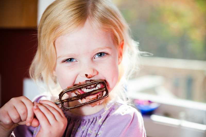
 A
A
 B
B
 C
C
Only 3 submissions this week.
Vote by telling us which pic you like the best by LETTER and tell us WHY in the comment section.
Only votes on the blog comment section are official and you can only vote for 1 pic. Voting will end at 10am on Saturday Oct 23rd.
Click on the word “comments” on the bottom of this post, and then click on name/url if you don’t have a google account, and type in your FIRST and LAST name for us so we know who you are.
ANONYMOUS POSTS WILL NOT BE ACCEPTED and only comments on the blog count!
go vote and tell your friends to vote too!!!
JIM baker


.jpeg)

by Jim Baker
C
I expected a knife, and instead was surprised to discover this is a family portrait, a short essay on procreation. The other two struck me as a little cliche? Not much, but this seemed a little more original.
My name is Tim Milligan
Outstanding week. Incredibly hard choice, but I melted with A. Love (LOVE) them all! B is very cool and C was very funny!
A is ridiculously cute. B has some great lines and sweet colour choice. C is just plain funny. I vote for C. Great photos all around.
A!
I love the lighting. I also love B and thought it was super creative.I think C was pretty funny, as well.
My vote is for B. Photo A is SUPER cute, but I love the color and the modern-art look that B has to it. I would totally hang it on the wall in my kitchen. 😉
C for sure. i love the spork and the conposition of it. I agree with the guy who said it looked like a family portrait…that’s exactly what came to my mind
I like C. It is cute how instead of a fork, their is a spork. Sporks remind me of Taco Bell and I sure did a lot of Taco Bell eating as a child. yum, yum!
C
It took me a second. At first I was like….wait that’s not right….then I realized how right it really was! it’s funny but it’s also shot really well.