So the Carpe Diem team has decided to get competitive. A little healthy competition is GOOD for us, it keeps our creative juices flowing.
The subject for our little shoot out was CHICKEN.
But we NEED your help. Vote on which picture you think is BEST and tell us WHY in the comment section of the blog. Only comments on the blog will be accepted as official votes.
Don’t worry right now about who shot what, I’ll let you know that once the votes are in. Lets see if we can get at least twenty votes! Voting ends Saturday the 25th at 10am.
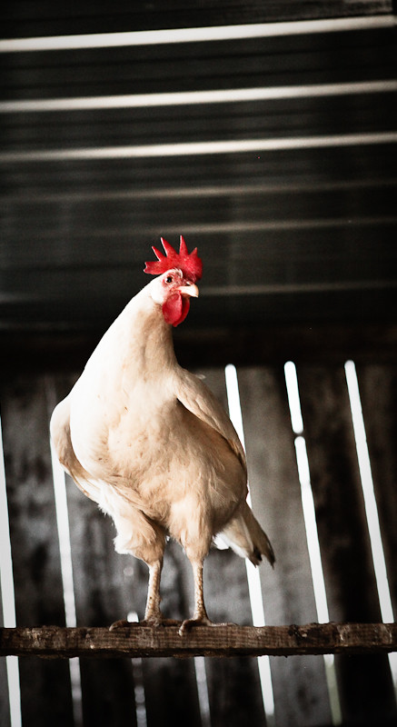
 A
A
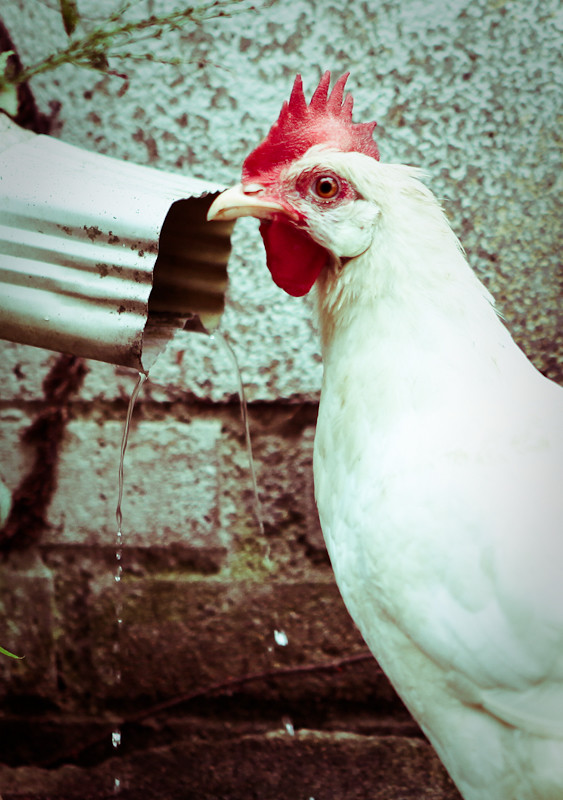
 B
B
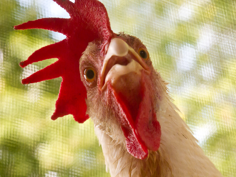
 C
C
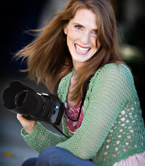
 D
D
JIM baker


.jpeg)

by Jim Baker
#2
the colors and the gutter.
and the chicken’s facial expression, he just made the picture come alive, with a twinge of sadness..
krista
lol They are all great. I especially love picture D. 🙂 No one captured the chickens emotions like picture D.
j/k I have to say I probably like picture A personally.
Great shots, all have merit but I’m a sucker for a close up…C, final answer.
😀
B & C are my favorites!
D is sick, guys. come on. 😉
This was a hard one. It was a toss up between B and C……drum roll please……..I’ll go with C in the end. I like how the Chicken is just in your face and so dominant! The color contrast is also very cool. The greens, white and reds….pretty sweet I would say! Although the colors in B are also very cool and the gutter just throws me back to my childhood, don’t have them there gutters here in Europe!
DL
C just plain scares me. I’m worried I’m gonna have some messed up dreams tonight. I’m gonna take A. B was pretty good too. I think D was just a slacker in this competition. I’m takingA
A has a certain majesty rarely found in a chicken
#2 Love the look on the chicken watching the water come out of the gutter. Looks like she is trying to decide if she wants a drink.
I’m going with a C. It’s just in your face and brings you down to the chickens level. The perspective and facial expression are amusing.
Letter B had a good concept behind it although i feel it has to much, idk blue tinge to it. It just feelsa little too far edited for my taste.
C is my choice, albeit it bizarre to see an up-close portrait of a chicken. Nice work.
B
definitely C. especially when you put it into context of what is going to happen to him (see photo D).
I like them all. Especially the humor of D. I like the rooster on the right in your heading too. Am I being difficult? Okay. I pick B
Ok, evidently I have to pick just 1… so B
A is great standing proud and tall as we all should thanks be to the Grace of God!! God Bless you and Jess, Pastor Jim!!
Andy
votings OVER. a TIE between B and C.
Jamie took A
Seth took B
Jess took C
Jim took D.