
Whats up everyone? Time again for another critique competition between the CARPE DIEM team! This week’s theme is CRAYON.
I know some of you wanted to vote last week and could not because of the required google account, that has CHANGED so now everyone can vote.
Vote telling us which pic you like the best by LETTER and tell us WHY!
Only votes on the blog comment section are official and you can only vote for 1 pic.
Voting will end at 11am on Saturday Oct 2nd.
All of the votes for the winning picture will be automatically entered in a random drawing and the winner picked will get an 8×12″ print of the winning picture!
The winning pic and print give away winner will be announced monday Saturday the 2nd on the blog.
– JIM baker
 A
A
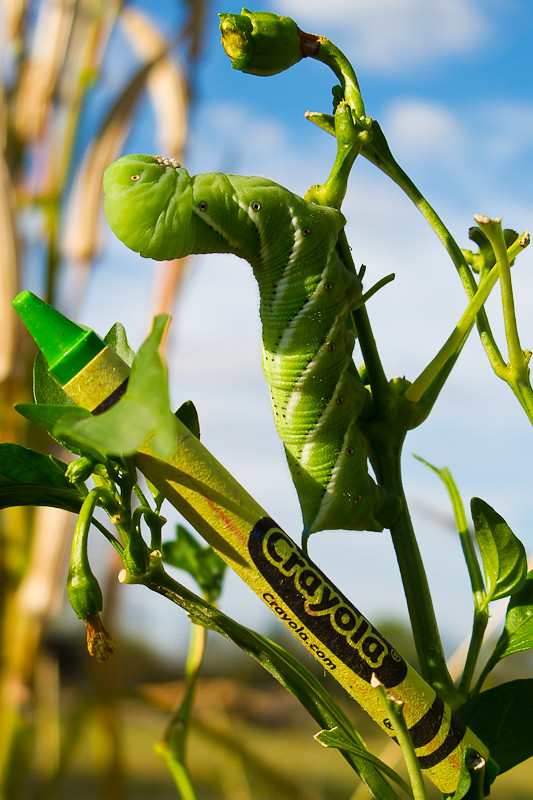 B
B
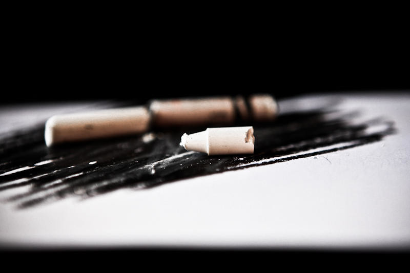 C
C
ANONYMOUS POSTS WILL NOT BE ACCEPTED and only comments on the blog count!
Click on the word “comments” on the bottom of this post, and then click on name/url if you don’t have a google account, and type in your FIRST and LAST name for us so we know who you are.
Visited 24 times, 1 visit(s) today


.jpeg)

by Jim Baker
D
B, I choose you!
“B” by a mile
A seems like it’s out of a 1950’s ad for cereal or breakfast or something. B is cool I really like it. The caterpillar scares me away a little. Cool pic though. C makes me depressed and I think of brokenness. D is cool. I like the circles of wrapper and blend of colors. It’s definitely between B and D…..I think I’m gonna go with D.
Definitely B. I love the color and the way it blends in
I guess I’m old fashioned as I like A. Can picture it framed and hanging on my kitchen wall.
I think I know who did C from an earlier comment…I can smell ’em…
I like B too because of the crazy idea. They’re all well done. I’ll still stick to A…
As much as I love the color in B… I’m going with A
because I have a soft spot for black and whites. 🙂 I love the contrast in the pic. It almost appears like a drawing.
All are great, but B is magnificent!
Sher likes B
I’d love A if it were color. Why crayons in a B&W?
D.
B. Great mix of color, crayon and caterpillar.
I choose a…perfect picture for a elem. school classroom I think 🙂
B – that is one cool @#$ worm!
Carpe Æternum
DL
I choose (A)
I just like that you cant really see the colors but you know what they should or could be and I love it anyways.. Kinda as in life.. I’d like to think that I or we view ppl in this way. LOL Hope that makes some sense, (Im drugged)
B. Is awesome but somewhat cartoony, I think my young daughter would love it.
C. As someone else said, looks Broken and Im not a fan of being broken..
D. Would be my second choice, really love the way the pic is focused and the use of light.
Gotta say I really enjoy this Jim as well as the breakfast comments and such- I was excited to see what you had for us! 🙂
I think they are all great, but D is my choice.
This is a hard decision. I like A for the textures in the apples. Just a neat shot.
But I think B gets my final vote. I love the bright green color. The caterpillar is amazing and a cool shot all by its self. Adding the crayon makes it an ever more creative picture.
I liked them all, but B is my favorite…maybe because I like green..
C is definitely my favorite.
It has a simplicity to it. Yet so much depth.
I vote C
It’s definitely between B and C for me. I love the bright colors and the similar angles with the caterpillar and crayon, in B. In C, I really like how simplistic and artsy it is and it almost has a ‘aged’ feel to it.
I think I’m going with C.
I choose C
very dramatic picture and the depth of field is awesome.
i may see this challenge a little differently than maybe what was expected but C really puts the primary focus on the crayon as opposed to some of the other shots that (although very creative) have elements within the photos that are a bit too distracting and take away too much focus from the crayon(s) themselves.
B does come in a close second but i just can’t get away from that small leaf thats blocking a little bit of the crayon
C. it has a different feel to it than the others and immediately sticks out to me. DOF is nice and has great contrast between the blacks and white.